BLOGGER TEMPLATES - TWITTER BACKGROUNDS »

Sunday, 27 February 2011

Conventions of a promo advert

The conventions of a promotional advert

  • Ratings/opinions/reviews from fans (quotations)
  • The band name
  • Tour date details
  • Album artwork
  • I-tunes/play com adverts
  • Website details
  • Singles (taken from)
  • Album name
  • Record label
  • Nominations and awards
  • Release date
  • Statistics of tickets
  • Bold letters
  • Picture of Album

Pictures of promotional album advertisements

Promotional Album Advertisements


To have a first hand experience to see how Albums are advertised I decided to buy a music magazine today to look through and study. I bought Q Magazine's latest issue

The title of the Magazine and the appearance of the cover did not come across as ' musical ' to me. However the big bold subheadings saying ' AMY WINEHOUSE' , ' BRITISH SONG WRITERS ' and ' BRITISH SONGS' gave me the impression that the magazine had articles related to the music industry. This helped influence my decision to buy it.


This two page spread at the beginning of the magazine was dedicated to an album advertisement. A full blows picture of the artist covers up a whole a page showing her importance and to make the reader aware of the artists image. Her pale , skin , red lipstick and dark hair and eyes give me the impression that her music will sound dark and gloomy. On the next page to the right quotes from multiple important organisations where there opinions matter are used to help influence the reader to the purchase the album. They are written in bold capital letters making the quotes stand out and visible to read.


A review article informing the readers on New Albums

A review article on Dubstep Albums and informing the reader on how to Buy Dubstep

Album Reviews within Magazines is another technique that is used to advertise albums. Album reviews helps to compare artists to one another and makes some stand out from the rest influencing the reader with their purchasing choice.


This album advertisement was placed at the back of the magazine on the glossy page making it more of a significance. The bands name is placed at the top of the advertisement and then the albums name is placed underneath in a smaller font. Below that a full blown picture of the band is placed, a quote from the magazine and the release date of the album is included.


Friday, 25 February 2011

Audience Feedback on Digipack


I decided to ask some people on their opinions on my digpack, because I asked closed friends and family to do so I advised them to be critical and avoid being biased to help me notice my mistakes and realise where I could improve as well as the positive feedback.


I decided to ask them a set of questions and here are some responses


Q1. What are your opinions of the appearance of my digipack?

"I really like the little drawings in the corner of the Album cover it adds a fun and interesting factor to the image but I think the appearance is a bit too simple. It's nice but simple. I think you could of added something more to the image to compliment the fun drawings in the corner"

" I like the image of the girl lying down and blurry-ness of the image. I also think the lighting used in the photo was good and the drawings in the corner giving me a insight into what she's thinking is very intersesting. But overall I think the appearance is too simple and boring..


Q2. If you were to see this in a music store what would you buy it? If No, why?

" Personally I don't think the Album cover would stand out compared to the rest of the digipacks within this genre. If I saw it in HMV amongst the digipacks I doubt it would be the first one to my capture my eye"

"No I woulnd'nt buy it because the image is not interesting enough to capture my attention"

Tuesday, 22 February 2011

Final Digipack


Final Digipack


Original Photo:

The original photo did not have an appealing factor and if I left it in it's original state the album cover would have been very boring and basic. For this reason I decided to edit it to make it look more interesting.


Editing Process:

I decided to Use photobucket to edit my photo. Photobucket is an on-line image hosting, video hosting, slide-show creation and photo sharing website that provides a photo editing software that enables me change the contrast, hue, saturation, lightness and size of images and also add effects, text and clip art to the images.

Front Cover :

Here is the original photo after the editing process.I brightened the lightness of the photo to give an effect of sunlight shining down on her. I also blurred around the edges of the image to give the impression that she is in a delusional thinking state on another planet day dreaming away. As she looks up to the left corner I decided to place some fun looking clipart in her eyesight direction to give an insight into what she is thinking of. On her chest I placed the name of the the artist in a black bold font and put the title of the album underneath it in another font.

Inside Left:


Usually in digipacks the music artist is known to leave a personal message thanking the fans and I have included this in my digipack also to give gratitude to those who helped her produce the album and have bought the album. On the right I placed her name in a font that looks similar to a hand written signature giving the impression that she personally wrote it her self added with some kisses. And I placed a pair of lips underneath the photo to portray the sense of love she has for her fans.

Inside Right:
I decided to use a picture of flowers for the background image where the CD is placed as the floral nature look fits the Genre of her music well.


Back Cover:


For the image of the back cover I decided to use a screen shot from the music video. On the right I placed the list of songs in the album from 1 to 10 and placed a little cartoon image of a flower underneath it. I also placed a bar-code in the right hand bottom corner to give the back cover a more realistic look.


Digipack Photo decision

Digipack Photo

After taking photo's of Elena our lead girl in the music video. I Narrowed the photos down to these two based on my opinion of the best ones that I could possibly use for my Album Cover.

Out of the two the photo below is my most favourite photo. I like how her face is tilted up showing that she is fixated on something else other than the camera and this could lead anyone to wonder what she is staring at. I also like the lime green spotlight hovering over her.It reminds me of someone being abducted by a UFO or something .. lol


This photo was the second one I chose because I liked how she is not facing the camera once again and the serious facial expression on her face.


I have decided to use the first image as my Album photo cover as I feel I could a lot more with the image and it would suit better with the whole genre of the music video.


Audience Feedback from Questionnaires

Audience Feedback Questionnaire GRAPHS

Saturday, 19 February 2011

Andrew Godwins Theory

After reading up on Andrew Godwins Theory I have learnt that

  • Music Videos demonstrate Genre and Characteristics E.g. stage performance for a rock band or nigh club based for dance music.
  • That there is a relationship between the lyrics and the visuals you are showing. Or the relationship between the two that they contradict each other.
  • The Demands of the record label, that will include the need for lots of close ups of the Artists and the developments of motifs. Which recur across most of the Artists work. This is called the Visual Style.
  • Voyeurism is used to increase the videos attractiveness, particularly to males, whilst intertextuality is often in humorous videos
  • Intertextual references, either to other music videos or to films and TV texts, these provide further gratification and pleasure for the viewer/fans
  • Music videos are based on repeitition as some music clips there are repetitive scenes and images that create an expectation for the audience to establish the genre.
  • Music videos do not have a closure or ending.
  • Music videos triggers a visual pleasure that is continuous which promotes the video
  • There is three different aspects of music videos; Illustration, Disjuncture and amplification.

Thursday, 10 February 2011

Florence and the machine album artwork

Florence and the machine album artwork


Above is the Album Cover for Florence and the Machine. A Photo of the lead singer in costume and make-up have been taken and looks as if it has been edited with an artistic skill to give a more dramatic effect on the image. Her pale skin contrasts with the dark background making her stand out more to give the impression that she is the focus of this image and is of importance as she is the lead singer.

To reflect the bohemian theme to her music a birds on tree branches are seen in the background to represent the naturalistic side to the bohemian culture. The lead singer is photographed looking to right avoiding eye contact giving the impression that her mind is else where and she is in deep thought.

Two different font types have been used to spell out the bands name and the title of the Album.
The word 'LUNGS' are spelt across her chest in capital letters over the Lungs that is shown externally over her chest. And the bands name is spelt in a unique font that will probably be a permanent font to help the bands name become recognisable.


For the cover of the Dog Days are over single two fonts are used once again for the Title of the song and the band name. A screen shot from the singles music video of Florence jumping in mid air is used for the front cover. I like the black borderline surrounding the photos on each of the covers making the photos stand out more.

Wednesday, 9 February 2011

Photos for Digipack

Today I brought in my camera and we decided to practice taking pictures for our Digipack allowing us to explore different angles , positions and lightings that we could possibly use for our picture shots. To Give our pictures a professional look we decided to do the photo shoot in the Drama studio where we had access to lighting, props and backgrounds.

Here we are decided on the angle, brightness and colour of the lighting


Here is a photo of Elizabeth lying on the floor with a lime green spotlight hovering over her face. The lighting brings out her eyes and I particularly like the shadows in this picture giving it a sense of darkness vs light.


Here is medium close up shot of Elizabeth looking calm and serene in the spotlight looking as if there is something on her mind in deep thought. I like this shot a lot as it reflects the emotional side of Pop-Soul music that often discusses serious matters such as heart break and this picture conveys emotion through her facial expression and body position.

Here is another close up of Elizabeth in the green lighting once again however this picture is more zoomed in making her facial expression the focus of attention. In this picture her first is slightly clenched possibly representing power, stress or pain.

Here we used the basic white lighting making her look pale and very bright in contrast to the dark shadows in the background.


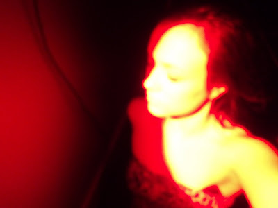
We decided to be even more experimental and use red lighting. Here Elizabeth is standing up in the corner of the room and the camera was placed at a high angle above her to take the photo. I like the contrast of the red and yellow on her skin and the red line outlining her body. The dark background makes her stand out more in the photo as well. Here she didn't make eye contact with the camera and her eyes are closed giving her the portrayal of a mysterious and questionable person.


In this photo the red lighting is shone over Elizabeth's face making her eyes look red and demented. This picture looks concerning and scary and looks like a shot out of a thriller film.


Saturday, 5 February 2011

Audience Feedback / Questionnaire

As a group we think it is very important that out production meets the expectations of our target audience and that it satisfies their viewing needs. In order for us to know what they want and what the like / dislike about our production so far we will have to carry out some primary research to investigate.


There are two ways that we could use to gain information from our audience each both have advantages and disadvantages helping us to make our decision on which one to choose.

Interview:

-Gives more personal responses

-Longer detailed answers

-Helps the interviewer to get reliable data and help the audience answer things in the way they want 9for example they may not understand the question properly on a questionnaire )

HOWEVER
-The process of Interviewing is time consuming and it is hard to process all the data.


Questionnaire:

-Can be anonymous so not much chance of demand characteristics

-Quick and easy to carry out

-Can receive both qualitative and quantitative data

HOWEVER
- People may not answer questions how we want them to if they don't understand what we are trying to ask

- May not be reliable data as they could get bored after some questions and start putting whatever they want down

- Doesn't allow the participant to give really long and detailed answers.


Advantages / Disadvantages of using qualitative and quantitative data

Pros of using Qualitative data

-Enables the person to go into thorough detail

-Gives a more personal view and is more reliable

Cons of using Qualitative data

-Hard to process the information

-Time consuming

Pros of using Quantitative data

-Quick to get

-Easy to process

-Receives a general idea of views and opinions


Cons of using Quantitative data

-Doesn't get a detailed response

-Doesn't allow the audience to give a description of why they liked / disliked certain things


After analysing the Advantages and Disadvantages it is clear to me that making a questionnaire would be better than Interviewing people as it would save us a lot of time. In order to gain detailed information from our audience we will ensure that we will add a lot Qualitative data in our questionnaire. This way we will know what our audience liked/ disliked specifically so we know exactly what to change , improve on and do more of.


QUESTIONNAIRE

As a group we have decided to conduct a questionnaire to print out and hand out to the public.This will help us determine how to market out product and what our target audience want from a video in our chosen genre.


Friday, 4 February 2011

Technical Fault

Today In class we decided to continue editing our music video. Unfortunately after logging into the macs we noticed that our Music Video didn't look like how we left it and we begun to suspect that someone in the group had done some editing. We asked our fellow group members whether they had done so but everyone said they did not edit the clip. We were then confused as to why our video had random shots in it.


Questioning the security of our MAC would of impossible as each group have been recently given unique passwords to access their own computers. We then noticed that our music video wasn't the only project on i movie that had been affected and we then assumed that it was probably a technical hitch.


However this actually helped us in that whilst putting it back together we noticed that we needed less 'filler' and that there were too many random shots in our footage. So we have decided to include studio shots in our video. We will achieve this by using a white background and setting two camera up to see either side of Eleanor's face, but that the cameras are not in each others view. This would mean we would no continuity errors as it was all in one take and we will have a variety of lip sync.


Tuesday, 1 February 2011

Framing and Composition


This is a screen shot from our music video and we have segmented it into squares to display that we have acknowledged the rule of thirds and put it into practice . Here is an example of how we have used the rule of thirds in our video. The silver industrial building in the background creates a line as does the car parking squares and Eleanor fills the middle third.