BLOGGER TEMPLATES - TWITTER BACKGROUNDS »

Monday, 11 April 2011

Final Music Video

Thursday, 7 April 2011

Images of Final Digipack and Final Poster

FINAL DIGIPACK


FINAL POSTER


Monday, 4 April 2011

Evaluation


Question 1 : In what ways does your media product use, develop or challenge forms and conventions of real media products?


Question 3; What Have You Learned From Your Audience Feedback?


Saturday, 26 March 2011

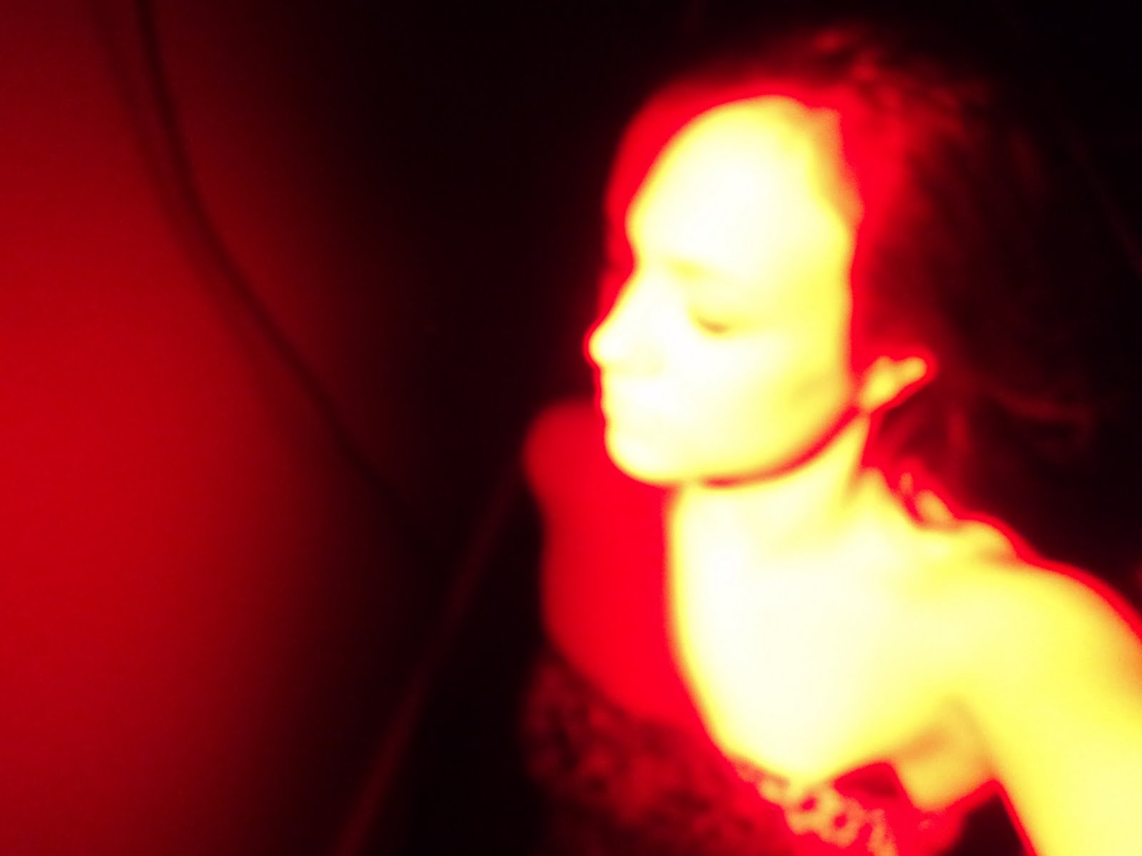
Music Video Viewing and Audience feedback


An A2 Media viewing session was held after school inviting teachers and students from all years view our music video. To gain some audience feedback on our music video from our target audience we gave members a viewing questionnaire to fill in about our video.

As well as the questionnaires to make gaining audience feedback more interesting we set up filming booths were people could talk about their likes and dislikes of our film to a camera. Above is a short video of an interview conducted by Eleanor about what Rachel thought about our video.

The majority of the responses were positive. Many people stated that the 'fighting' shots were their favourite and others preferred the running and fast paced shots. And some said that they enjoyed our choice of song and this shows we chose a song relevant to our audience.

Here are some selected quotes of feedback we received:

"Loved the running shots"

"Favourite part was the jumping in the rain shot"

"Loved the shot of Eleanor facing the train tracks and the lighting - gorgeous"

"My favourite part was the stop animation of the daffodils before happiness"


Friday, 25 March 2011

Music Video Draft


In this draft we have updated the stairs section of our video, so that the red in Eleanor's top stands out more against the stark white and black background creating a contrast. We compromised with some of the yellow of the bannisters being visible in the scene as we thought that this would be a fair sacrifice as the red top is highly symbolic in our film, the continuity of the colour also represents continuity of our music video.

The credits we eventually decided on was called black fade, a simple bar across the bottom. However there were more elaborate options, including organic which although very natural and fitting to our genre appeared a little over the top on our already heaving with nature video. Also the title 'lower' was too simple as it had no outline and was simply text meaning it looked like it was made onto the video.

Friday, 18 March 2011

Stop Animation Practice


An idea we came up with was using stop animation in our music video to make it more interesting to watch. The stop animation of the burger was our first practise attempt.We also experimented with other symbolic ideas such as Eleanor crushing petals then reversing it to symbolise healing, one of the major themes in our video.

Wednesday, 9 March 2011

Music Video Draft


In this draft we changed the lip syncing to a different shot of Eleanor on the train tracks. Although we had to take out the lip syncing we felt that this scene would have been a better choice overall, as the lip syncing detracted from the upbeat feel of the video. Whereas the new shot although not the lip synch we originally planned for is far more fitting to the pace and feel of the song.

Tuesday, 8 March 2011

Audience Feedback on Poster


To gain some audience feedback on my Poster I decided to people on their opinions on it.

"I like the bold letters used in the poster , they are really clear to read and stand out to me a lot. I also like the colourful bright yellow floral pattern used in the background, its pretty. The clarity and simplicity of the poster works really well"

"I like the brightness of the poster and the fact that it has quotations from two of my favourite music magazines. This would make me consider on listening to the album and finding out more about the artist and their music"


Monday, 7 March 2011

FINAL Album Promotional Poster/ Magazine Advertisement


After creating my first draft of the poster and getting audience feedback on it I was able to receive constructive criticism and add the changes suggested to my poster to improve it's appearance and make it's purpose of attracting my target audience and to influence them to buy the album, making it more effective.

Here in my poster I have included clear simple messages, a basic image to catch the audiences attention and short to the point text.I have also used the Album cover as my image to help it become recognisable to our target audience.In my poster I have also included some quotes from popular newspapers and magazines. I purposely did this so that it would have an influential impact on the audiences views to encourage them to by the by the album.


The produced using the simple Microsoft paint software which allowed me cut and paste images , crop images and insert images and text. I decided to decorate the poster with a bright floral background to represent the the naturist side of pop-soul music.


Saturday, 5 March 2011

Album promotional posters - Rihanna


Album Promotional Posters

For my Album promotion poster research I decided to focus on the female pop music artist Rihanna. Throughout her years in the music industry she has changed her image multiple times to possibly widen her music experiences within different music markets/ genres.

The album promo pictures used for her 2010 Album ' Rated R' appealed to me the most because they have a 'Raw cut edge' feel to it. The Combination of danger, rebelliousness and sex into one must have attracted a lot of peoples attention towards the posters.

In this promo picture below Rihanna is seen with a machine gun prepared for battle in a spiky futuristic outfit that could possibly represent her new sharp and edgy look. The Album's Logo is placed on the top left hand corner of the poster. The Letter 'R' not only symbolises her name but it also stands for the R in the title of her Album. The contrast of the black and white is a powerful tool used to make the poster stand out and three of her song titles are cleverly blended into the photo.


This promotional poster below shows Rihanna covering her half naked body with a board with the name of one her singles on it. Here implied nudity is used to attract people to the poster and again the album's logo is used to to help the viewer recognise the title of her album.


Friday, 4 March 2011

Target Audience

From analysing the data we received demographic information and an insight on consumer attitudes / trends/ needs.


From the data we found out that:


•The age of our target audience are aged between 16-20.

A large percentage of our target audience are female

A large percentage of the people questioned chose pop music as their favourite genre.

A large percentage regularly watch music videos of their favourite genre

The majority said that they watched music videos on you tube

The majority said they often listen to the song first before viewing the video

The majority listened to music everyday

The majority said that they preferred to watch a narrative style music video

Tuesday, 1 March 2011

Album Promotional Poster/ Audience feedback

Here is my first draft of my Album poster. I decided to ask people what their opinions were on it and here are a a few chosen replies.


"I like that the image of the album is included in the design of the poster but the heading of the poster is not clear , the font is very difficult to read and understand"

"The poster is too plain and simple , some colour added to it would be interesting, it has a very boring appearance. Not eye catching at all "

"I think the poster needs to include more information. All this poster does is tell me that a new album is out it does nothing to influence me to buy the album"

From the feedback I was given I will now ensure that I will

- Include more information about the album

- Add colour to make it look more interesting and to improve it's appearance to make it eye catching

- Change the font of the heading so it is more easy read

Sunday, 27 February 2011

Conventions of a promo advert

The conventions of a promotional advert

  • Ratings/opinions/reviews from fans (quotations)
  • The band name
  • Tour date details
  • Album artwork
  • I-tunes/play com adverts
  • Website details
  • Singles (taken from)
  • Album name
  • Record label
  • Nominations and awards
  • Release date
  • Statistics of tickets
  • Bold letters
  • Picture of Album

Pictures of promotional album advertisements

Promotional Album Advertisements


To have a first hand experience to see how Albums are advertised I decided to buy a music magazine today to look through and study. I bought Q Magazine's latest issue

The title of the Magazine and the appearance of the cover did not come across as ' musical ' to me. However the big bold subheadings saying ' AMY WINEHOUSE' , ' BRITISH SONG WRITERS ' and ' BRITISH SONGS' gave me the impression that the magazine had articles related to the music industry. This helped influence my decision to buy it.


This two page spread at the beginning of the magazine was dedicated to an album advertisement. A full blows picture of the artist covers up a whole a page showing her importance and to make the reader aware of the artists image. Her pale , skin , red lipstick and dark hair and eyes give me the impression that her music will sound dark and gloomy. On the next page to the right quotes from multiple important organisations where there opinions matter are used to help influence the reader to the purchase the album. They are written in bold capital letters making the quotes stand out and visible to read.


A review article informing the readers on New Albums

A review article on Dubstep Albums and informing the reader on how to Buy Dubstep

Album Reviews within Magazines is another technique that is used to advertise albums. Album reviews helps to compare artists to one another and makes some stand out from the rest influencing the reader with their purchasing choice.


This album advertisement was placed at the back of the magazine on the glossy page making it more of a significance. The bands name is placed at the top of the advertisement and then the albums name is placed underneath in a smaller font. Below that a full blown picture of the band is placed, a quote from the magazine and the release date of the album is included.


Friday, 25 February 2011

Audience Feedback on Digipack


I decided to ask some people on their opinions on my digpack, because I asked closed friends and family to do so I advised them to be critical and avoid being biased to help me notice my mistakes and realise where I could improve as well as the positive feedback.


I decided to ask them a set of questions and here are some responses


Q1. What are your opinions of the appearance of my digipack?

"I really like the little drawings in the corner of the Album cover it adds a fun and interesting factor to the image but I think the appearance is a bit too simple. It's nice but simple. I think you could of added something more to the image to compliment the fun drawings in the corner"

" I like the image of the girl lying down and blurry-ness of the image. I also think the lighting used in the photo was good and the drawings in the corner giving me a insight into what she's thinking is very intersesting. But overall I think the appearance is too simple and boring..


Q2. If you were to see this in a music store what would you buy it? If No, why?

" Personally I don't think the Album cover would stand out compared to the rest of the digipacks within this genre. If I saw it in HMV amongst the digipacks I doubt it would be the first one to my capture my eye"

"No I woulnd'nt buy it because the image is not interesting enough to capture my attention"

Tuesday, 22 February 2011

Final Digipack


Final Digipack


Original Photo:

The original photo did not have an appealing factor and if I left it in it's original state the album cover would have been very boring and basic. For this reason I decided to edit it to make it look more interesting.


Editing Process:

I decided to Use photobucket to edit my photo. Photobucket is an on-line image hosting, video hosting, slide-show creation and photo sharing website that provides a photo editing software that enables me change the contrast, hue, saturation, lightness and size of images and also add effects, text and clip art to the images.

Front Cover :

Here is the original photo after the editing process.I brightened the lightness of the photo to give an effect of sunlight shining down on her. I also blurred around the edges of the image to give the impression that she is in a delusional thinking state on another planet day dreaming away. As she looks up to the left corner I decided to place some fun looking clipart in her eyesight direction to give an insight into what she is thinking of. On her chest I placed the name of the the artist in a black bold font and put the title of the album underneath it in another font.

Inside Left:


Usually in digipacks the music artist is known to leave a personal message thanking the fans and I have included this in my digipack also to give gratitude to those who helped her produce the album and have bought the album. On the right I placed her name in a font that looks similar to a hand written signature giving the impression that she personally wrote it her self added with some kisses. And I placed a pair of lips underneath the photo to portray the sense of love she has for her fans.

Inside Right:
I decided to use a picture of flowers for the background image where the CD is placed as the floral nature look fits the Genre of her music well.


Back Cover:


For the image of the back cover I decided to use a screen shot from the music video. On the right I placed the list of songs in the album from 1 to 10 and placed a little cartoon image of a flower underneath it. I also placed a bar-code in the right hand bottom corner to give the back cover a more realistic look.


Digipack Photo decision

Digipack Photo

After taking photo's of Elena our lead girl in the music video. I Narrowed the photos down to these two based on my opinion of the best ones that I could possibly use for my Album Cover.

Out of the two the photo below is my most favourite photo. I like how her face is tilted up showing that she is fixated on something else other than the camera and this could lead anyone to wonder what she is staring at. I also like the lime green spotlight hovering over her.It reminds me of someone being abducted by a UFO or something .. lol


This photo was the second one I chose because I liked how she is not facing the camera once again and the serious facial expression on her face.


I have decided to use the first image as my Album photo cover as I feel I could a lot more with the image and it would suit better with the whole genre of the music video.


Audience Feedback from Questionnaires

Audience Feedback Questionnaire GRAPHS

Saturday, 19 February 2011

Andrew Godwins Theory

After reading up on Andrew Godwins Theory I have learnt that

  • Music Videos demonstrate Genre and Characteristics E.g. stage performance for a rock band or nigh club based for dance music.
  • That there is a relationship between the lyrics and the visuals you are showing. Or the relationship between the two that they contradict each other.
  • The Demands of the record label, that will include the need for lots of close ups of the Artists and the developments of motifs. Which recur across most of the Artists work. This is called the Visual Style.
  • Voyeurism is used to increase the videos attractiveness, particularly to males, whilst intertextuality is often in humorous videos
  • Intertextual references, either to other music videos or to films and TV texts, these provide further gratification and pleasure for the viewer/fans
  • Music videos are based on repeitition as some music clips there are repetitive scenes and images that create an expectation for the audience to establish the genre.
  • Music videos do not have a closure or ending.
  • Music videos triggers a visual pleasure that is continuous which promotes the video
  • There is three different aspects of music videos; Illustration, Disjuncture and amplification.

Thursday, 10 February 2011

Florence and the machine album artwork

Florence and the machine album artwork


Above is the Album Cover for Florence and the Machine. A Photo of the lead singer in costume and make-up have been taken and looks as if it has been edited with an artistic skill to give a more dramatic effect on the image. Her pale skin contrasts with the dark background making her stand out more to give the impression that she is the focus of this image and is of importance as she is the lead singer.

To reflect the bohemian theme to her music a birds on tree branches are seen in the background to represent the naturalistic side to the bohemian culture. The lead singer is photographed looking to right avoiding eye contact giving the impression that her mind is else where and she is in deep thought.

Two different font types have been used to spell out the bands name and the title of the Album.
The word 'LUNGS' are spelt across her chest in capital letters over the Lungs that is shown externally over her chest. And the bands name is spelt in a unique font that will probably be a permanent font to help the bands name become recognisable.


For the cover of the Dog Days are over single two fonts are used once again for the Title of the song and the band name. A screen shot from the singles music video of Florence jumping in mid air is used for the front cover. I like the black borderline surrounding the photos on each of the covers making the photos stand out more.

Wednesday, 9 February 2011

Photos for Digipack

Today I brought in my camera and we decided to practice taking pictures for our Digipack allowing us to explore different angles , positions and lightings that we could possibly use for our picture shots. To Give our pictures a professional look we decided to do the photo shoot in the Drama studio where we had access to lighting, props and backgrounds.

Here we are decided on the angle, brightness and colour of the lighting


Here is a photo of Elizabeth lying on the floor with a lime green spotlight hovering over her face. The lighting brings out her eyes and I particularly like the shadows in this picture giving it a sense of darkness vs light.


Here is medium close up shot of Elizabeth looking calm and serene in the spotlight looking as if there is something on her mind in deep thought. I like this shot a lot as it reflects the emotional side of Pop-Soul music that often discusses serious matters such as heart break and this picture conveys emotion through her facial expression and body position.

Here is another close up of Elizabeth in the green lighting once again however this picture is more zoomed in making her facial expression the focus of attention. In this picture her first is slightly clenched possibly representing power, stress or pain.

Here we used the basic white lighting making her look pale and very bright in contrast to the dark shadows in the background.


We decided to be even more experimental and use red lighting. Here Elizabeth is standing up in the corner of the room and the camera was placed at a high angle above her to take the photo. I like the contrast of the red and yellow on her skin and the red line outlining her body. The dark background makes her stand out more in the photo as well. Here she didn't make eye contact with the camera and her eyes are closed giving her the portrayal of a mysterious and questionable person.


In this photo the red lighting is shone over Elizabeth's face making her eyes look red and demented. This picture looks concerning and scary and looks like a shot out of a thriller film.


Saturday, 5 February 2011

Audience Feedback / Questionnaire

As a group we think it is very important that out production meets the expectations of our target audience and that it satisfies their viewing needs. In order for us to know what they want and what the like / dislike about our production so far we will have to carry out some primary research to investigate.


There are two ways that we could use to gain information from our audience each both have advantages and disadvantages helping us to make our decision on which one to choose.

Interview:

-Gives more personal responses

-Longer detailed answers

-Helps the interviewer to get reliable data and help the audience answer things in the way they want 9for example they may not understand the question properly on a questionnaire )

HOWEVER
-The process of Interviewing is time consuming and it is hard to process all the data.


Questionnaire:

-Can be anonymous so not much chance of demand characteristics

-Quick and easy to carry out

-Can receive both qualitative and quantitative data

HOWEVER
- People may not answer questions how we want them to if they don't understand what we are trying to ask

- May not be reliable data as they could get bored after some questions and start putting whatever they want down

- Doesn't allow the participant to give really long and detailed answers.


Advantages / Disadvantages of using qualitative and quantitative data

Pros of using Qualitative data

-Enables the person to go into thorough detail

-Gives a more personal view and is more reliable

Cons of using Qualitative data

-Hard to process the information

-Time consuming

Pros of using Quantitative data

-Quick to get

-Easy to process

-Receives a general idea of views and opinions


Cons of using Quantitative data

-Doesn't get a detailed response

-Doesn't allow the audience to give a description of why they liked / disliked certain things


After analysing the Advantages and Disadvantages it is clear to me that making a questionnaire would be better than Interviewing people as it would save us a lot of time. In order to gain detailed information from our audience we will ensure that we will add a lot Qualitative data in our questionnaire. This way we will know what our audience liked/ disliked specifically so we know exactly what to change , improve on and do more of.


QUESTIONNAIRE

As a group we have decided to conduct a questionnaire to print out and hand out to the public.This will help us determine how to market out product and what our target audience want from a video in our chosen genre.


Friday, 4 February 2011

Technical Fault

Today In class we decided to continue editing our music video. Unfortunately after logging into the macs we noticed that our Music Video didn't look like how we left it and we begun to suspect that someone in the group had done some editing. We asked our fellow group members whether they had done so but everyone said they did not edit the clip. We were then confused as to why our video had random shots in it.


Questioning the security of our MAC would of impossible as each group have been recently given unique passwords to access their own computers. We then noticed that our music video wasn't the only project on i movie that had been affected and we then assumed that it was probably a technical hitch.


However this actually helped us in that whilst putting it back together we noticed that we needed less 'filler' and that there were too many random shots in our footage. So we have decided to include studio shots in our video. We will achieve this by using a white background and setting two camera up to see either side of Eleanor's face, but that the cameras are not in each others view. This would mean we would no continuity errors as it was all in one take and we will have a variety of lip sync.


Tuesday, 1 February 2011

Framing and Composition


This is a screen shot from our music video and we have segmented it into squares to display that we have acknowledged the rule of thirds and put it into practice . Here is an example of how we have used the rule of thirds in our video. The silver industrial building in the background creates a line as does the car parking squares and Eleanor fills the middle third.

Monday, 31 January 2011

Audience Research

Audience Research is a major element for any media producer. Companies are set up to carry out audience research for media producers , broadcasters and advertisers. Media Producers need to know how the audience is made up. A mass audience is very large, so ways of breaking it down into categories have been devised from Higher Management positions to Unemployed people.


Primary Research

Primary Research for audience research is direct investigation of the needs , desires and media habits of an audience. It involves contacting and talking directly to members of the target audience individually on the phone, by email or questionnaire.

Secondary Research

Secondary research looks at data and other research that has already been undertaken about the audience. Today Secondary research is very largely carried out on the internet and magazines. By consulting a wide range of opinions and sources a sound critical analysis can be constructed.

Qualitative Research

Qualitative Research is about investigating the reasons why audiences consume a particular text. It is done through a discussion and by setting up focus groups. Questionnaires can be constructed to establish audience preferences , desires and opinions or to measure the success of a media text or product.

Quantitative Research

Quantitative Research is about collecting facts and figures and other data to do with the size of the audience. This can be a breakdown of the number of people, including their gender , age and location , who make up and audience.


Sunday, 30 January 2011

Album Cover - Sleevage.com


When researching album covers on the internet I came across a really useful website called

Sleevage.com

Sleevage is a blog all about music cover art. From the LP’s of the 60′s to the digital artworks of now. They post the best or most interesting covers every week in an effort to become the world’s best resource for great music artwork. Sleevage is another blog by Soap Creative a digital creative agency based in Sydney, Australia and Los Angeles.

The website focuses on the Art work and Design of thousands of Album Covers from multiple Musical Genres and allows people to search a specific artists album and informs them on how the album cover was created and who created it allowing others to find inspiration.

I liked this website a lot and found it very useful and inspirational.


Saturday, 29 January 2011

Digipack Research

Digipack Research


A digipack is ..
  • An economical way of a company making an album in a different way.
  • A new format of a CD packaging made from card, It holds different parts of the lyrics and will have special features and DVD.
The codes and conventions are ..

  • Visuals are key to the production, includes images of the artist/band, shit from concert and instruments.
  • Band and artist name and album title; making the brand easily identify. Can be included along the spine and on the main cover.
  • List of all the songs on the back.
  • Basic information on the band and all the background information.
  • Reviews from newspapers and magazines.

Why would a record label choose to release a didgipack instead of a CD?

  • Many reasons why, but the main reason is that is is cheaper for them to produce.

Are there added benefits for the consumer when buying it?

  • People would rather buy it because there is more things in there like more tracks and a DVD and maybe special features that you cant get on a normal CD.


Digipaks typically consist of a gatefold (book-style) paperboard or card stock outer binding, with one or more plastic trays capable of holding a CD or DVD attached to the inside.

Although less vulnerable to cracking than a jewel case, the disc tray inside the package (particularly the "teeth" of the hub which secure the disc in place) remains rather brittle and is prone to cracking if the package is crushed. Digipak-style cases grew in popularity among record labels and recording artists in the early 2000s.

The disadvantages of Digipacks is that they are flimsy and open to wear and tear more easily. I have personally noticed that with the Digipaks in my CD collection, the plastic trays fallout because the glue has dried up.

Saturday, 15 January 2011

Montage editing


This afternoon we decided to try and edit the verse before the sad montage and the sad montage itself. There were numerous problems with our footage however the most prominent would seem the lack of usable lip syncing clips. While much of the chorus is usable the lip syncing of the verses is much weaker and needs to be re filmed possibly tommorow in Cuffley.

Another problem is the first running shot underground. The camera swerves and looses Eleanor, when we tried cutting the mistake and inserting other footage everybody agreed it looked better shaky and wrong than with random footage which did not fit the mood of the lyric.

Wednesday, 12 January 2011

Abuse Scene


Align Centre

This is a montage that we edited showing various abuse scenes between the male and female characters in our Music Video. We edited the clip using a lot of slow motion and gave the clip a grainy and blurry appearance to give the impression that the scenes were a series of events that were being thought of or dreamt about to represent someone reminiscing and dwelling on the past.

Saturday, 8 January 2011

Album Cover Research

While recording artists and bands are busy recording their albums, a separate effort is usually being made behind the scenes to plan for the launch, promotion and circulation of the new tracks. The creation of CD cover art is an integral part of this process.

Some CD covers feature heavily edited and airbrushed vanity photos of the musicians or recording artists. Thankfully, others are much more creative and work to create a cover image that reflects the mood, attitude or feel of the music it promotes. The most striking designs are those that capture both a buyer’s attention and the essense of the music.

Majority of CD cover art designs and concepts present dramatic, quirky, unusual or unique artwork. This type of cover art can make a big difference when a little-known band releases an album. Captivating or iconic cover art can make a band instantly recognizable, which increases sales, which in turn boosts airplay and subsequently demand for the music. Mainstream marketing is rarely this attractive, and the wide variety of beautiful CD cover art makes browsing CDs an enjoyable experience that reaches far beyond the music.

Thursday, 6 January 2011

Album Art Work


Here are some Obscure and Remarkable album covers that stand out from the crowd
attracting the consumer to question about the artists and their music influencing them to buy the album.

Daydreamer in 100 Obscure and Remarkable CD Covers

Daydreamer - Dialogue (2008)
Bold slpashes of gold and red are used on this cd cover, which features a clever typography image. Haunting eyes peek out from beyond a mass of golden words that serve as hair.

Rootsthingsfallapart in 100 Obscure and Remarkable CD Covers

The Roots - Things fall apart (1999)
This album was released with five different covers, each depicting a social disaster. The most striking of the five, seen here, shows African American teenagers being chased down a street in Brooklyn during the Civil Rights era

Cruelmelody in 100 Obscure and Remarkable CD Covers

Black Light Burns - Cruel Melody (2007)
Taking a more classical route on this cover art, Black Light Burns manages to catch a browser’s eye.


Sgtpeppers in 100 Obscure and Remarkable CD Covers

The Beatles - Sgt. Peppers Lonely Hearts Club Band (1967)

Some say no collection of cover art is worth mentioning without this cover.

Moreskin in 100 Obscure and Remarkable CD Covers

More Skin With Milk-Mouth - Giraffes? Giraffes? (2007)
Nothing seems to make sense here, yet it works on this cd cover. More flying fish, an invasion of ladybugs and a Roman statue all fit together in this intriguing, colorful mess.


Evan in 100 Obscure and Remarkable CD Covers

Evanescense - The Open Door (2006)
A moody and romantic tone is set with this cd cover art design. The mystery lies on the other side of the door.


Shewantsrevenge in 100 Obscure and Remarkable CD Covers

She wants revenge (2005)
This self-titled album made a splash with this striking cover art.